Keep This Chart on Your Radar

Posted October 21, 2020
Graham Summers
We’ve spent the last few days outlining how the markets are predicting a Trump win on November 3, 2020.
Today I’d like to address another issue. One that will arise no matter who’s in the White House.
That issue is inflation.
As I’ve noted since May, the Fed and other policymaker’s response to the economic shutdown triggered by the COVID-19 pandemic was likely to unleash a higher rate of inflation.
First and foremost, central banks have been MUCH more aggressive with their money printing than they were in response to the 2008 crisis.
Remember, to combat the economic fallout from the Great Financial Crisis of 2008 central banks printed $12 trillion between 2008 and 2016.
Well, they’ve printed more than HALF of this ($7 trillion) in the six months from April to September alone. Throw in stimulus programs from governments and the number balloons over $15 TRILLION.
Put another way, it previously took policymakers EIGHT years to spend $12 trillion. They’ve already committed to spending MORE than this in less than EIGHT months.
Also — and this is key — between stimulus payments and central bank lending facilities funneling money directly to small businesses / Main Street, much of this money is actually going straight into the economy.
In the U.S., we’ve already seen one stimulus program of $3 trillion. On top of this, the Fed has put over $1.6 TRILLION in actual, real money into the U.S. economy in the form of credit facilities. Add that up and you’re talking about $5+ trillion in new money entering the economy this year.
And now Congress is talking about another stimulus program somewhere between $500 million and $1.8 trillion being funneled into the economy sometime in the next three months. That would put the total money printing for 2020 in the ballpark of $7 trillion.
Let’s put this into perspective. The U.S. economy is roughly $22 trillion in size. In the span of a single year, policymakers will have funneled an amount of money equal to nearly 33% of U.S. GDP directly into the economy.
THAT’s how you get inflation.
One Sign Inflation is About to Explode
As I noted last week, the Fed’s own research shows that a rise in food prices has been the single best predictor of future inflation.
With that in mind, one of the most important charts to watch for determining when inflation is about to get truly NASTY, is the ratio between agricultural commodities and stocks.
This chart compares the performance of agricultural commodities to that of the stock market. When agricultural commodities outperform stocks, this line rises. And when stocks outperform agricultural commodities, this line falls.
There is a clear downtrend here indicating that stocks have been outperforming agricultural commodities for years. It looks as though this trend might finally be ending with a breakout to the upside hitting last month. However, given that there have been several false breakouts in the last few years, it’s still too early to make a definitive call.
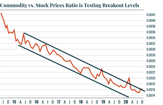
Keep this chart on your radar. Once we get a confirmed breakout to the upside, big inflation is arriving, and it will be time to take action with some inflation trades.
Best Regards,
Graham Summers
Editor, Money & Crisis